

10 Inspiring Responsive Design Examples That Redefine Cross-Device UX in 2025
The web hasn’t been static for over a decade. With mobile traffic consistently exceeding 50% of global internet usage, responsive design is no longer a luxury—it’s the baseline. Yet simply using media queries to stack boxes doesn’t make a site truly responsive. Thoughtful responsive design means the interface feels native on every screen: desktop, tablet, phone, foldable, and even the smart fridge display that QA keeps forgetting to test.
In this post, we’ll analyze 10 standout responsive design examples from real production sites. We’ll break down the CSS techniques, layout strategies, and interaction patterns that make them shine. And for developers who want to accelerate their own responsive builds, we’ll show how tools like DivMagic can instantly copy any UI component you love—adapting it to your own project in seconds.
The Anatomy of an Excellent Responsive Design
Before we dive into the examples, let’s establish what separates good from great in responsive implementation. Modern responsive design isn’t just about shrinking columns. It requires:
- Fluid typography that scales smoothly using clamp() or viewport units without awkward breakpoint jumps.
- Context-aware navigation that toggles between a full menu, a hamburger, a bottom tab bar, or an expandable drawer based on available screen real estate and touch targets.
- Art-directed responsive images that deliver not only different resolutions but different crops and compositions per breakpoint.
- Touch-friendly interactions with minimum 44x44px tap targets and gestures that work across devices.
- Performance parity where the mobile experience isn’t a stripped-down afterthought but a first-class citizen.
Example 1: Stripe – Navigation That Adapts to Your Thumb
Stripe’s homepage is a masterclass in progressive disclosure. On wide viewports, the main navigation spans across the top with dropdowns and descriptive text. As the viewport narrows, the top bar consolidates into a compact mobile menu icon. But here’s the detail that many miss: on tablet-sized viewports (768–1024px), the navigation transforms into an off-canvas menu triggered by a prominent “Menu” button placed in the bottom-right corner—exactly where a right-handed user’s thumb naturally rests when holding a tablet in landscape mode.
This is responsive design with biomechanics in mind. The CSS behind it uses not only @media width queries but also pointer: coarse to detect touch devices. Stripe combines flexbox for primary layout, grid for product cards, and container queries for internal component reflow. A developer who wants to replicate this pattern can inspect the element, but copying the entire responsive logic manually would take hours of reverse-engineering. With DivMagic, you can simply select the navigation component on any breakpoint, copy it, and paste it into your own codebase—complete with all responsive rules extracted and reorganized.

Example 2: Apple – Art Direction Across Devices
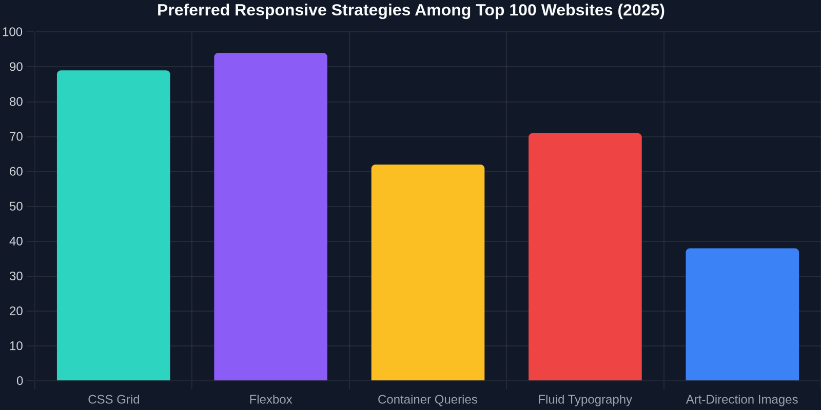
Apple’s product pages don’t just scale images; they swap entire compositions. The hero section for the latest MacBook shows a wide-angle shot of the laptop on desktop, a closer product shot with floating feature callouts on tablet, and a tight macro of the keyboard with minimal text on mobile. This is achieved with the <picture> element and srcset attributes, combined with JavaScript-free CSS using the object-fit and object-position properties.
Recreating this level of art direction typically requires a cross-functional team of designers and developers iterating over three breakpoint-specific layouts. If you’re a solo frontend developer or part of a small team, you can shortcut this by using DivMagic to capture each responsive variant of a hero section you admire. DivMagic extracts the exact CSS grid rules, responsive image sources, and typography scale, so you can study the implementation and adapt it without building everything from scratch.
Example 3: The New York Times – Intrinsic Web Design in Action
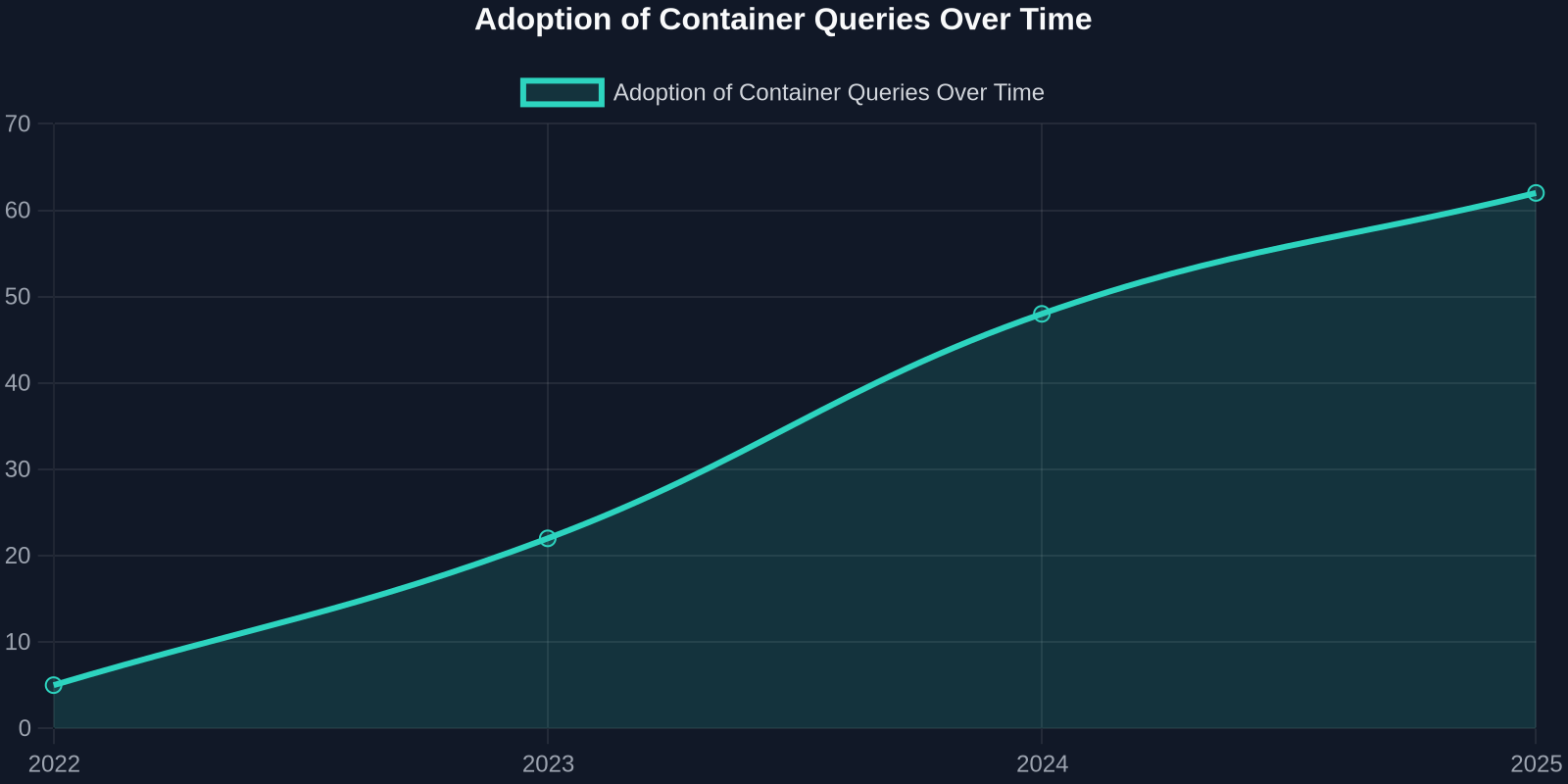
News layouts present a unique challenge: long-form reading must remain comfortable on a phone while presenting sidebars, related stories, and rich media on larger screens. The New York Times adopts an “intrinsic design” approach where components decide their own layout based on available space rather than just the viewport width. Container queries power this behavior: article body text uses a max-width of 65ch for optimal line length, while asides and infographics reflow when the parent container crosses threshold widths.
Their recipe combines CQ units (cqi, cqb) with CSS grid auto-sizing. For developers, this means you no longer write a mountain of breakpoints; you write one flexible component that works anywhere. However, the complexity lies in scoping styles correctly. DivMagic helps by capturing the computed styles and container query rules of any Times article component, giving you a reusable snippet that you can drop into your own CMS, newsletter templates, or blog.
“The best responsive design doesn’t feel like design at all—it feels like the content was meant to be exactly where it is.” — Jen Simmons, Design Advocate at Mozilla
Example 4: Dribbble – A Fluid Grid That Breathes
Dribbble’s shot feed is a classic masonry-style layout that reflows effortlessly from five columns on large screens down to two on mobile. But under the hood, it’s not actually using JavaScript-based masonry. Instead, CSS grid’s grid-template-columns: repeat(auto-fill, minmax(280px, 1fr)) does the heavy lifting. This creates a perfectly responsive, gap-consistent grid without any media queries at all.
The secondary win is performance: browsers can paint grid layouts faster than flexbox when there’s no need for row-height balancing. If you’re building a portfolio, e-commerce listing, or any card-based UI, you can grab this exact grid implementation from Dribbble using DivMagic. Just select the shots container, copy, and paste into your Next.js, React, or plain HTML project—the CSS grid rules will be perfectly extracted.
| Approach | Time to Implement | Responsive Robustness | Code Maintainability |
|---|---|---|---|
| Manual media queries | 4-6 hours | Medium | Low |
| CSS Grid auto-fill | 1-2 hours | High | High |
| DivMagic copy + adapt | 15 minutes | Production-ready | High |
Example 5: Airtable – Spreadsheet UI on Every Screen
Airtable’s spreadsheet interface is notorious for its complexity. On desktop, you see a full grid with toolbars, record details, and view switchers. On mobile, it transforms into a card-based kanban with swipeable rows. The magic lies in the component hierarchy: Airtable doesn’t have a separate desktop and mobile app; it has one codebase that dynamically renders views based on available container width and device capabilities.
Key CSS tactics: container style queries toggle between display: table-row and display: flex based on the parent’s width, while custom properties drive cell padding and font-size. For developers who need to build data-heavy responsive dashboards, this is the gold standard. DivMagic can capture a snapshot of Airtable’s responsive record component, giving you a head start on complex layout logic that would otherwise take weeks to refine.

Example 6: Smashing Magazine – Content-First Typography
Smashing Magazine proves that you can have a text-heavy site that reads beautifully on any device. Their secret is fluid typography powered by clamp(): headings scale from 1.5rem up to 3rem, line-height adjusts with calc(), and paragraph max-widths use ch units. No breakpoint-specific font-size declarations anywhere.
When combined with a modular scale and a vertical rhythm that holds across viewports, the reading experience feels printed even on a 320px-wide screen. For content-heavy projects—blogs, documentation, newsletters—you can extract Smashing’s entire typography system in one click using DivMagic. Paste it into your CSS and instantly get a professional reading experience without fiddling with dozens of type rules.
Example 7: Headspace – Animation That Adapts
Headspace’s calming illustrations and animations aren’t just decorative; they’re responsive. On larger screens, background illustrations animate with parallax and looping SVGs. On mobile, those same animations are replaced with static, smaller versions to save battery and CPU. The prefers-reduced-motion media query is also respected.
This two-tier animation strategy is becoming essential as web vitals like Interaction to Next Paint (INP) gain weight. Developers can inspect and copy Headspace’s animation CSS, including keyframes and media query conditions, with DivMagic’s full-property extraction mode. Even the fallback static images are captured in the responsive image syntax, so you have a complete adaptive animation pattern ready to use.
Example 8: Dropbox – Progressive Enhancement in Forms
Dropbox’s signup form is deceptively simple. On desktop, it sits to the right with a large illustration on the left. On mobile, it takes full width with a smaller illustration above. But the real responsive win is how input types adapt: date pickers use <input type="date"> on mobile to trigger the native OS picker, while on desktop they use a custom JavaScript date picker for consistency.
This pattern uses feature detection via CSS @supports and JavaScript capability checks, not just screen size. It’s a perfect example of progressive enhancement tailored to device capabilities. DivMagic captures both the desktop and mobile markup, giving you a reference implementation for your own forms that respect the user’s platform.
Example 9: GitHub – Responsive Code Review
Reading and reviewing code on a phone used to be a nightmare. GitHub’s responsive diff view now uses horizontal scrolling containers for code blocks, with sticky line numbers and a split view that becomes inline on narrow viewports. The layout uses CSS subgrid to align code additions and deletions even when columns wrap.
Under the hood, GitHub combines overflow-x: auto on <pre> elements with position: sticky for the gutter, all inside a responsive two-column grid that collapses to a single column below 768px. Developers building documentation sites, technical blogs, or code-heavy apps can copy this exact responsive code block directly with DivMagic, eliminating hours of CSS grid tinkering.
Example 10: Notion – Block-Based Fluid Layout
Notion’s entire interface is built from blocks that can be dragged, resized, and rearranged. Responsiveness is inherent: a two-column text block becomes stacked on mobile; an inline database turns into a card view. This is achieved by treating every block as an independent responsive component with its own container query logic.
The CSS architecture uses BEM with utility classes and custom properties that cascade responsiveness. The result is a product that works the same across web, desktop, and mobile. For developers building design tools or CMSs, Notion’s approach is inspirational. You can extract Notion’s responsive block patterns with DivMagic’s component-level copy; e.g., grab a kanban board component and see how it reflows from columns to stacked cards.
“DivMagic cut our UI rebuild time by 70% because we didn’t have to manually guess the responsive breakpoints of components we loved. We just copied and adapted.” — Sarah M., Frontend Lead at a SaaS startup
Common Responsive Design Pitfalls (and How DivMagic Helps Avoid Them)
After auditing hundreds of responsive sites, I see the same mistakes repeatedly:
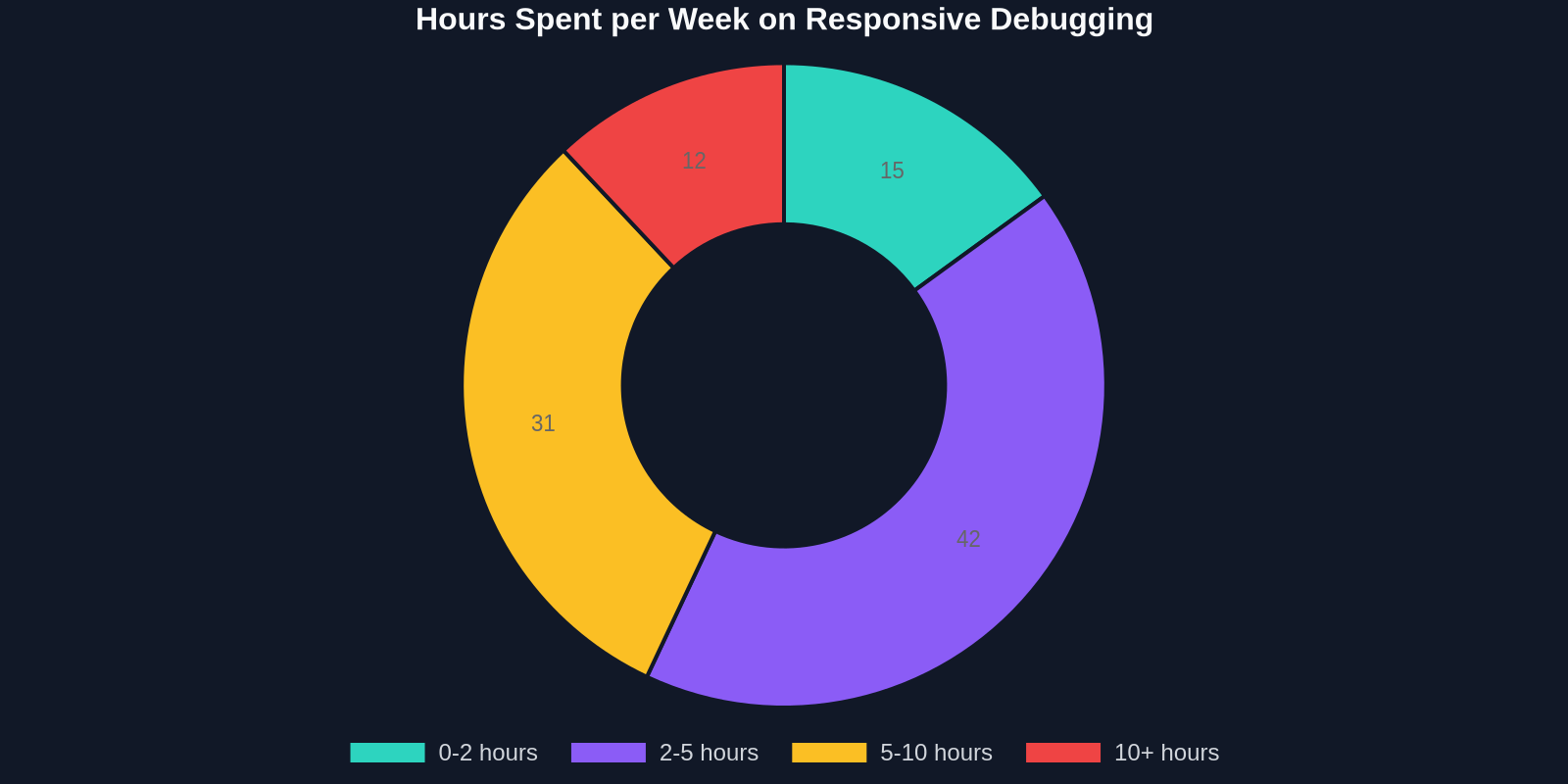
- Breakpoint overload: A dozen @media rules scattered across files, leading to specificity wars. Modern responsive design favors container queries and fluid sizing to reduce breakpoints.
- Hidden content on mobile: Display:none on important navigation or calls-to-action, hurting both UX and SEO. Instead, restructure or progressive disclose.
- Viewport meta tag missing or malformed: Surprisingly still common. Always include
<meta name="viewport" content="width=device-width, initial-scale=1">. - Unoptimized images: Serving 4K desktop images to mobile and relying on the browser to downscale.
DivMagic acts as both a learning tool and a productivity booster. By copying real-world responsive components, you see exactly which CSS properties and values professionals use to solve concrete layout problems. You’re not copying an entire design—you’re extracting a proven responsive module that you can integrate and customize.
How to Use These Examples in Your Own Projects
Studying these sites is invaluable, but the real magic happens when you incorporate their patterns into your work. Here’s a practical workflow:
- Identify a component you admire from any of the examples above.
- Open DivMagic in your browser and click on that component while in the desired responsive viewport size.
- DivMagic extracts the HTML structure, all computed CSS, media queries, container query rules, and responsive image sources.
- Paste the exported code into your project’s component file. The CSS is clean, non-minified, and commented with the source breakpoints.
- Adjust colors, fonts, and content to match your brand, while keeping the robust responsive skeleton intact.
This turns a multi-hour reverse-engineering task into a five-minute creative adaptation. Whether you’re building a marketing site, a dashboard, or a SaaS app, starting from a proven responsive base eliminates the most frustrating part of frontend development.
Conclusion: The Future Is Fluid, Not Fixed
The best responsive design examples teach us that we’re past the era of ‘desktop, tablet, mobile’ breakpoints. The web is a continuum of screen sizes, input modes, and user contexts. Modern CSS gives us the tools—container queries, fluid clamp(), CSS grid, and intrinsic sizing—to build truly fluid experiences. The examples we’ve dissected show that with the right strategies, you can create UIs that feel native everywhere.
And when you find a chart topper that solves a niche layout problem you’ve been struggling with for days, don’t just admire it — copy it. With DivMagic, you’re not cutting corners; you’re standing on the shoulders of design systems that cost millions to develop, adapting that craftsmanship to your own work in seconds.
Next time you’re stuck on a responsive layout, open DivMagic, capture the component you love, and spend your creative energy where it matters most: making the experience uniquely yours.