

Improving Site Performance by Shipping More CSS
There is an instinct baked into modern frontend work that says the fastest page ships the least of everything: less JavaScript, fewer fonts, fewer requests. So when GitHub's engineering team wrote about improving site performance by shipping more CSS, it read like a contradiction. The fix for a slow, JavaScript-heavy interface was not to strip styling out of the app. It was to put more of it back in, as plain, static, cacheable stylesheets, and to delete the JavaScript that existed only to generate styles in the browser.
The distinction is the entire article. Shipping "more CSS" does not mean a bigger stylesheet bloating your critical path. It means moving style generation out of the runtime and into the build, then letting the browser do what it is genuinely excellent at: parsing a stylesheet once, caching it, and reusing it across every navigation.
The Hidden Cost of Runtime Styling
CSS-in-JS libraries solved real problems. They gave component authors scoping, colocation, and the ability to interpolate props into styles without inventing a naming convention. The tradeoff was architectural: they moved a compile-time problem into the browser.
Style generation is JavaScript work
Every server-rendered page using a runtime CSS-in-JS library asks the browser to do the same job twice. The server serializes styles into <style> tags, then the client library wakes up, walks the component tree, hashes class names again, and reconciles the result. That work happens on the main thread, competing with the very layout and paint steps you are trying to accelerate.
// Runtime CSS-in-JS: this stylesheet does not exist until hydration runs
const Button = styled.button`
  background: ${(p) => (p.primary ? "#1f883d" : "transparent")};
  border: 1px solid #d0d7de;
  padding: 6px 16px;
  border-radius: 6px;
  font: inherit;
`;
The same component expressed as a build-time stylesheet removes both the runtime dependency and the serialization work:
/* button.module.css, parsed once, cached forever */
.button {
  padding: 6px 16px;
  border: 1px solid #d0d7de;
  border-radius: 6px;
  font: inherit;
  background: transparent;
}
.buttonPrimary {
  background: #1f883d;
  color: #ffffff;
}
import styles from "./button.module.css";

export function Button({ primary, ...props }) {
  const className = primary
    ? `${styles.button} ${styles.buttonPrimary}`
    : styles.button;

  return <button className={className} {...props} />;
}
Nothing here is novel. What is easy to underestimate is how much of a bundle a mature CSS-in-JS stack quietly owns: the library itself, the prop-interpolation utilities, the theme provider, the serializer, and the duplicate framework code that grows when every package depends on its own copy.
It sits directly on the critical rendering path
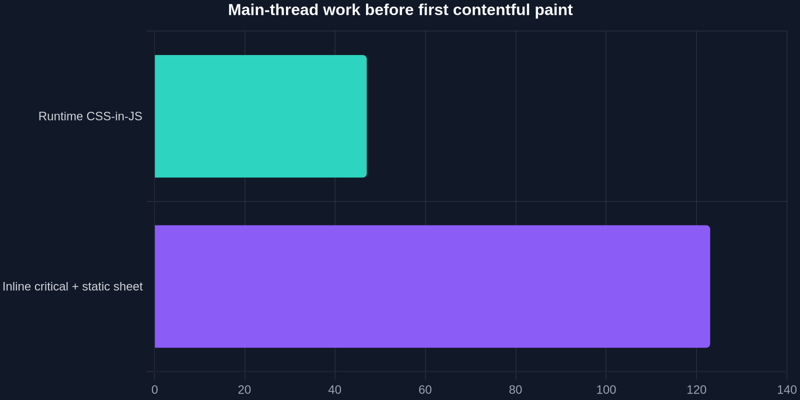
A <link rel="stylesheet"> blocks rendering, but it blocks it once, and the browser can parse the file while the HTML stream is still arriving. Runtime CSS works differently: the browser cannot even begin to build the component styles until the JavaScript has been downloaded, parsed, compiled, and executed. On a mid-tier phone that is a second or more of main-thread work before a single button gets its background color.
It fragments your cache
Generated class names change whenever component source changes, which means the stylesheet invalidates on nearly every deploy. Split that across dozens of route-level bundles and you get a cache hit rate that looks healthy in a dashboard but rarely fires on repeat visits. A content-hashed static stylesheet, by contrast, can be served with Cache-Control: public, max-age=31536000, immutable and effectively never be downloaded twice.
It doubles work during hydration
Hydration mismatches between server-injected and client-generated styles are a classic source of flicker. The browser paints one set of rules, then the client library replaces them mid-interaction, forcing a style recalculation and sometimes a layout shift. Static class names computed at build time are identical on both sides, so the first paint is also the final paint.
What GitHub Actually Changed
The migration is best understood as five architectural moves rather than one refactor. None of them requires abandoning a component model, and none requires a full rewrite.

Design tokens became CSS custom properties
Color, spacing, radius, and typography scales moved into a global :root block as custom properties. Components reference var(--color-bg-default) instead of importing a JavaScript theme object. This is what makes static CSS expressive enough to replace dynamic styles in most cases, and it enables runtime theming (dark mode, high contrast) with zero JavaScript.
Component styles compiled ahead of time
Each component got a real stylesheet, emitted at build time and scoped by a hash or module convention. The output is ordinary CSS that any browser can parse at parse speed.
Critical CSS inlined in the document head
Only the rules needed for the first viewport are inlined into the HTML. That is typically 8–14 KB gzipped, and it means the first paint never waits on a network round trip for the stylesheet that shapes the visible page.
<head>
  <!-- Critical: exactly what the first viewport needs, nothing more -->
  <style>
    /* reset + tokens + header + hero + above-the-fold grid */
  </style>

  <!-- Everything else: one hashed, immutable, long-cached file -->
  <link
    rel="stylesheet"
    href="/assets/app.8f3a1c2d.css"
    media="print"
    onload="this.media='all'"
  />
  <noscript>
    <link rel="stylesheet" href="/assets/app.8f3a1c2d.css" />
  </noscript>
</head>
Server-rendered markup carries final class names
Because class names exist at build time, the HTML the server returns is already styled. There is no second pass, no reconciliation step, and no flash of unstyled content on slow connections.
Cascade layers replaced specificity hacks
A shared design system lives or dies on predictable cascade order. Declaring layer order once, up front, makes overrides deterministic and removes the incentive to reach for !important or ever-deeper selectors.
@layer reset, tokens, base, components, utilities;

@layer components {
  .card {
    background: var(--color-canvas-default);
    border: 1px solid var(--color-border-default);
    border-radius: var(--radius-2);
    padding: var(--space-4);
  }
}

@layer utilities {
  .mt-4 { margin-top: var(--space-4); }
}
The Numbers: What Changes When You Ship More CSS
Moving style generation to build time changes the shape of what you ship, not just the volume. The bytes that remain are cheap: they compress well, they are shared across every route, and they are cached for a year.
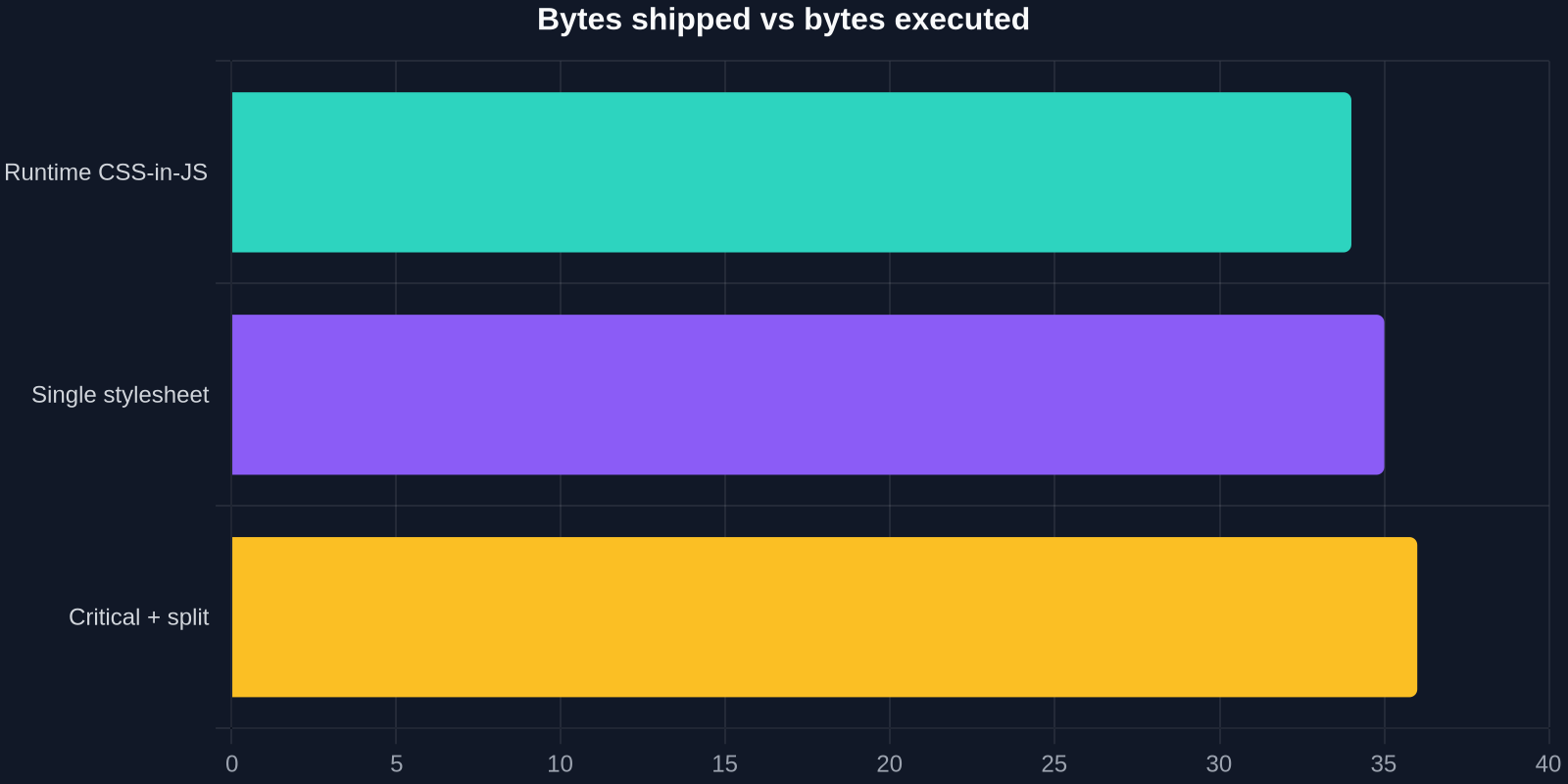
The architectural payoff shows up in four places at once: less JavaScript to download, less main-thread work before first paint, a cacheable stylesheet shared across navigations, and identical markup on server and client.
| Approach | JS shipped (gzip) | CSS shipped (gzip) | Runtime style work | Cacheable across deploys |
|---|---|---|---|---|
| Runtime CSS-in-JS | ~180 KB | ~12 KB | High | No |
| Single monolithic stylesheet | ~96 KB | ~88 KB | None | Yes |
| Inline critical + split static sheets | ~78 KB | ~54 KB | None | Yes |
| Utility-first CSS | ~85 KB | ~40 KB | None | Yes |
The fastest stylesheet is the one the browser parses once, caches for a year, and never has to generate again.
A Practical Migration Playbook
You do not need GitHub's codebase to apply the same reasoning. The migration is incremental and each step is independently shippable.
1. Inventory what actually renders at runtime
Open DevTools, load a page, and count document.styleSheets. If you find dozens of injected <style> tags with hashed class names, you have found your target. Cross-reference with the Performance panel: look for long tasks between DOMContentLoaded and first contentful paint.
2. Extract above-the-fold CSS
Start with the smallest possible inline block. A reliable heuristic is to inline reset, tokens, and the rules used by the first two viewport heights. Everything below the fold loads from the deferred stylesheet.
3. Convert runtime components to static classes
Work component by component, starting with the highest-traffic ones. Prop-driven variants become either modifier classes or custom properties set on a wrapper. Keep the component API identical so call sites do not change.
// Genuinely dynamic values still belong in an inline style, not a generated sheet
<div
  className={styles.progressBar}
  style={{ "--progress": `${percent}%` }}
  role="progressbar"
  aria-valuenow={percent}
/>
.progressBar {
  width: var(--progress, 0%);
  transition: width 200ms ease-out;
}
This pattern is the workhorse of the whole migration: the structure of the style is static and cacheable, while the value stays dynamic and costs nothing to update.
4. Establish layer order early
Declare @layer order at the top of your entry stylesheet before you have a specificity problem, not after. Retrofitting layers onto a legacy cascade is far more painful than starting with them.
5. Hash filenames and cache immutably
Content hashing plus immutable is what turns "more CSS" into "free CSS". The second page view in a session should hit the HTTP cache for every style rule on the site.
6. Keep truly dynamic styling dynamic
Transform, scroll position, and measurement-driven values belong in inline styles, requestAnimationFrame, or the Web Animations API. Do not reintroduce a runtime style engine to solve a problem CSS custom properties already solve.
How to Measure the Improvement
Measure the same three things before and after: paint timing, main-thread long tasks, and stylesheet count. A small PerformanceObserver script gives you all three without adding a monitoring dependency.
new PerformanceObserver((list) => {
  for (const entry of list.getEntries()) {
    console.log(entry.name, Math.round(entry.startTime));
  }
}).observe({ type: "paint", buffered: true });

new PerformanceObserver((list) => {
  const long = list.getEntries().filter((e) => e.duration > 50);
  console.log(`${long.length} long tasks after load`);
}).observe({ type: "longtask", buffered: true });

console.log("stylesheets:", document.styleSheets.length);
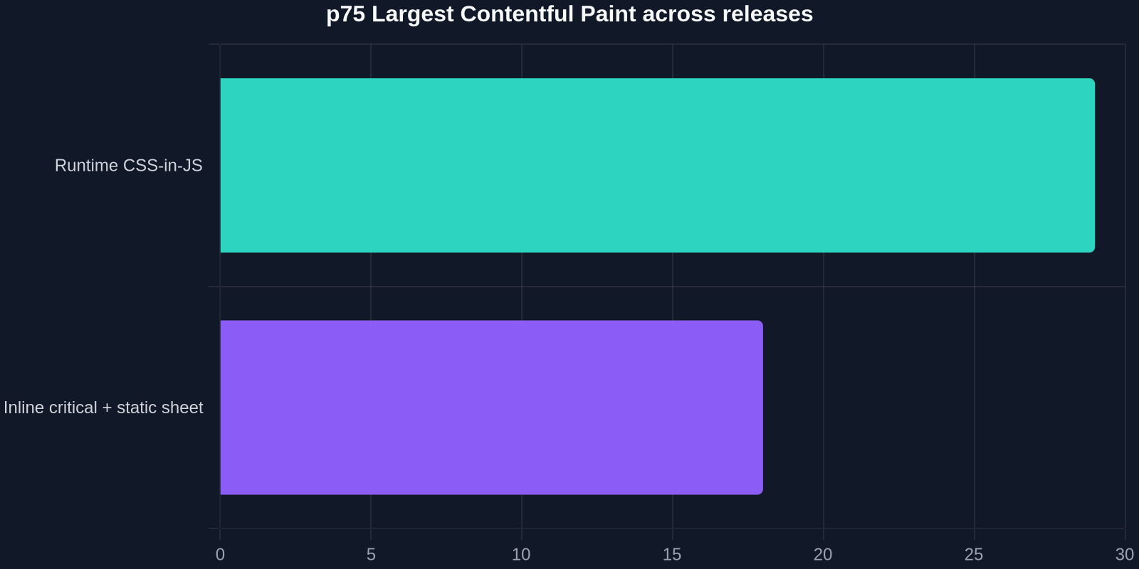
Expect the biggest movement in time-to-first-paint on repeat visits and on throttled mobile profiles, where the eliminated JavaScript parse cost dominates. Largest contentful paint tends to improve more gradually, release over release.
Pitfalls Worth Avoiding
The approach is not risk-free, and most failures come from applying it too aggressively.

- Incomplete critical CSS. If you guess wrong about the first viewport, you get a visible reflow as the deferred sheet arrives. Generate the critical block automatically from a real render rather than by hand.
- Inlining everything. Inlining the full stylesheet into every HTML response defeats caching and inflates document size. Inline the minimum, defer the rest.
- Bundle-everything instincts. The old advice to concatenate all CSS into one giant file predates HTTP/2. Splitting by route is often better now, as long as shared primitives are cached separately.
- Mixing two systems. Running runtime CSS-in-JS and static stylesheets side by side for too long doubles your style surface and makes cascade debugging miserable. Set a migration deadline per component directory.
The most common non-technical pitfall is treating this as a big-bang rewrite. The teams that succeed convert a handful of high-traffic components, measure the delta, and use that data to justify the next batch.
Using DivMagic to Reverse-Engineer Real CSS Architecture
One underrated part of this migration is seeing how mature production sites actually structure their stylesheets. When you inspect a site that ships static CSS well, you can learn more in five minutes than in an hour of reading documentation: how they layer the cascade, how they scope tokens, how they split critical from deferred, and how they name modifiers.
DivMagic is built for exactly that workflow. Instead of hand-copying element styles out of DevTools one rule at a time, you select any UI on any page and pull the resulting HTML and CSS directly into your editor, ready to adapt. That is genuinely useful in two situations: prototyping a component from a reference design, and studying how a high-performance site you admire organizes its cascade so you can mirror the pattern in your own design system.
It also shortens the boring part of step three above. When you are converting a runtime component into static classes, having the final computed styles in an editable form, rather than as scattered inline styles and injected <style> blocks, removes most of the transcription work.
Key Takeaways
- Runtime style generation is main-thread JavaScript work that happens after the JavaScript download, directly on your critical rendering path.
- Static CSS is parsed once, cached for a year when content-hashed, and shared across every route and every navigation.
- Inline only the rules the first viewport needs; defer the rest behind a non-blocking
<link>and a long cache policy. - CSS custom properties plus
@layercover the vast majority of cases that used to require prop-driven style interpolation. - Migrate incrementally, component by component, and measure p75 paint timing and long tasks rather than averages.
Shipping more CSS sounds like a regression until you realize you are trading a cached, parse-once stylesheet for megabytes of JavaScript that rebuilt it on every page load.
The lesson generalizes well beyond GitHub. Every abstraction that runs in the browser is a cost paid by the user, on their device, on their network, every single time. Moving style generation to build time is one of the highest-leverage trades available to a component-driven frontend, you ship a static file the browser already knows how to handle, and you delete the machinery that used to get in its way.