

How Texas Launched an Accessible, Standardized Web Design System to Modernize Government Sites
On the sprawling digital landscape of Texas state government, a quiet revolution is underway. With over 100 different agencies, each historically maintaining its own web presence, the user experience for Texas citizens has been, to put it mildly, inconsistent. One agency's site might be a masterclass in intuitive navigation, while another looks like it time-traveled from the dial-up era. The State of Texas has officially launched a comprehensive, accessible, and standardized web design system to bridge this gap. This initiative isn't just about making sites look pretty; it's a fundamental shift toward equity, efficiency, and modern frontend architecture in the public sector.
For frontend developers and UI engineers working in or with government, this signals a major change. It's a move away from proprietary, siloed development toward a shared, component-driven future. At its core, the Texas design system provides a single source of truth for visual language, interaction patterns, and reusable code. This means a "Submit" button looks, feels, and, crucially, behaves identically whether you're renewing your driver's license, applying for a hunting permit, or filing a business tax form. For developers, this is a dream scenario: less reinvention of the wheel, more focus on solving unique problems, and a built-in guarantee of accessibility compliance.
The technical underpinnings of such a system are fascinating. It's more than a style guide; it's a living, breathing codebase of components, tokens, and patterns. Imagine a project built on a modern JavaScript framework like React or Vue, with a component library that packages up all the state's branding, typography, and accessibility rules into neat, importable modules. Developers can simply pull in a <StateHeader> or a <FormInput> component, and instantly get visual consistency, on-brand styling, and critical features like screen-reader-friendly labels and focus indicators without writing the logic from scratch. This is the power of modern design tokens, where color, spacing, and typography values are abstracted into a central, platform-agnostic JSON file that can be compiled down into Sass variables, CSS custom properties, and even native mobile app styles.
The business case is equally compelling. An inconsistency in forms is more than an aesthetic nuisance; it's a tax on citizen time. A usability study might find that a confusing multi-step form on one site has a 40% abandonment rate, costing the state millions in overdue or uncollected fees. This design system directly attacks that kind of interface friction.
The Frontend Architecture: Components, Tokens, and Version Control
Let's get under the hood. For a frontend developer, the truly exciting part of a statewide design system is its implementation. The Texas system no doubt leans heavily on the concept of a single-package component library, likely published to a private npm registry or a platform like GitHub Packages. This single-source-of-truth approach solves the classic "oops, we updated the button color on the marketing site and forgot about the intranet" problem.
Design Tokens: The DNA of the System
At the atomic level of this system are design tokens. These are platform-agnostic variables that represent every visual design decision. Think of them as a key-value store for your UI's DNA.
Instead of hard-coding a hex code #0A2E5D for "Texas Blue" into dozens of CSS files, you define a token like color-primary-600: #0A2E5D. That token is then transformed by a tool like Style Dictionary into whatever output you need:
- CSS:
--color-primary-600: #0A2E5D; - Sass:
$color-primary-600: #0A2E5D; - JavaScript (for styled-components):
export const colorPrimary600 = '#0A2E5D';
This means if the state's branding undergoes a refresh, updating a single JSON file cascades the change everywhere. No more manual search-and-replace across 100 agency repos.
The Component Layer: A Button is Finally Just a Button
The component library itself is where the tokens come to life. A <MegaMenu> component doesn't just include CSS; it encapsulates JavaScript logic for keyboard navigation, ARIA roles for screen readers, and mobile responsiveness. The developer at the Texas Department of Agriculture doesn't need to know the intricacies of the aria-haspopup attribute. They just write <MegaMenu items={navItems} /> and get a fully accessible, state-approved navigation bar. This encapsulation is the key to enforcing accessibility at scale.
A Practical Code Pattern: The Accessible Form Field
To visualize this, consider how a typical agency developer might implement an accessible text field before and after the design system.
Before (Agencies on their own): A developer might write a quick, visually-lazy field that lacks proper labels and error handling.
<input type="text" name="firstName" placeholder="First Name" required>
After (With the Texas Design System): The developer consumes a component that bakes in the label association, error message container, and visual affordances.
import { FormField, TextInput } from '@texas-ds/react';

function MyForm() {
  const [error, setError] = useState('');

  return (
    <FormField
      label="First Name"
      errorMessage={error}
      isRequired
      onStateChange={(val) => validateAndSet(val)}
    >
      <TextInput
        defaultValue=""
        placeholder="e.g. Jane"
        aria-describedby="firstname-hint"
      />
    </FormField>
  );
}
The <FormField> wrapper automatically links the label to the input, creates an aria-describedby connection to the error and hint text, and manages the visual error state. This isn't just less code; it's a fundamentally more robust user experience for every Texan.
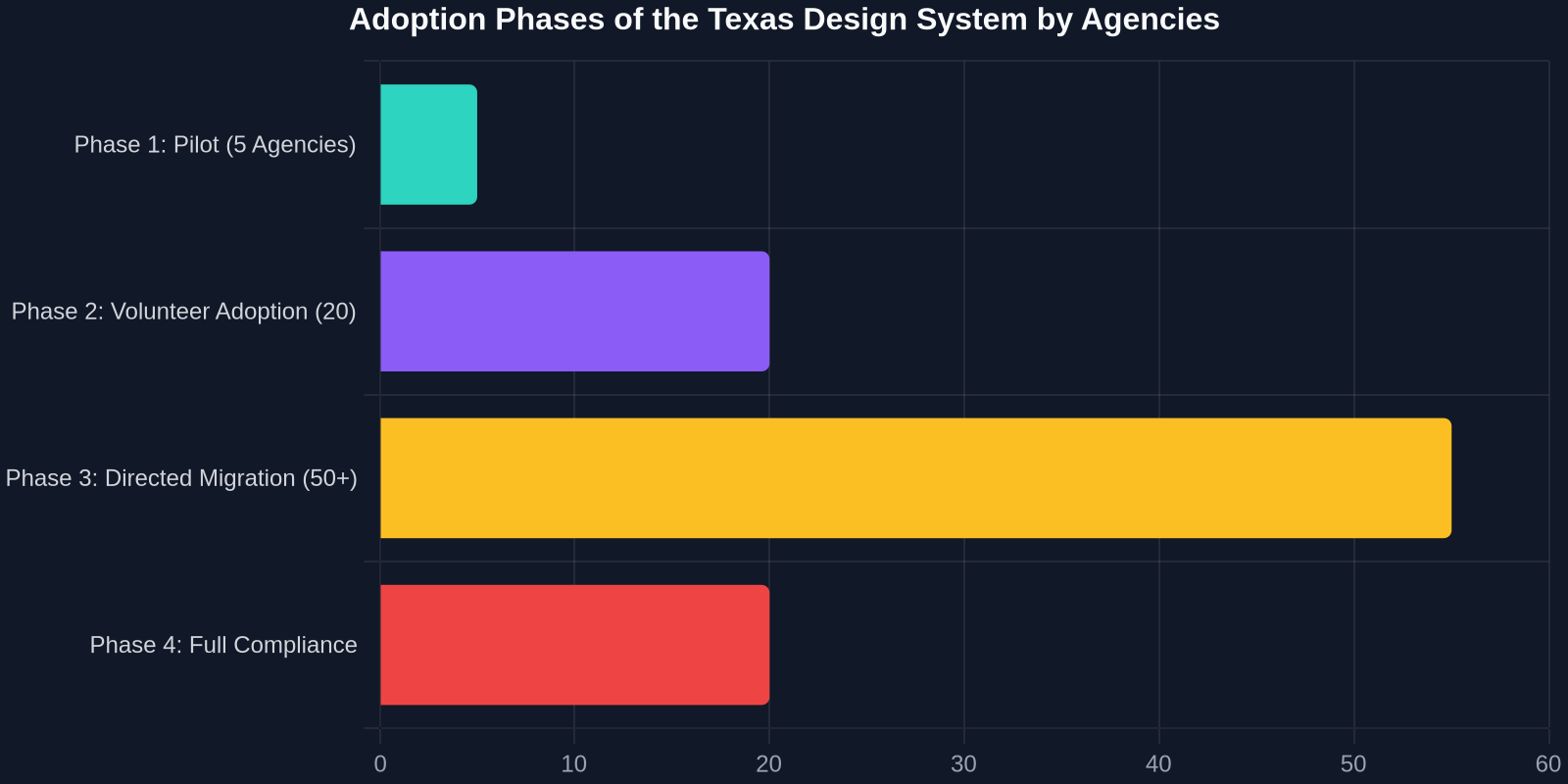
Taming Multi-Agency Complexity with Governance and Versioning
A component library isn't a "set it and forget it" solution. It breathes. It needs versioning, a clear contribution model, and an unbreakable release cadence to avoid splintering back into chaos. The Texas design system's technical team poses a critical question: how do you let 100+ development teams, each with their own product deadlines, safely adopt, suggest, and contribute to a single, shared codebase?

The answer lies in a robust Semantic Versioning (SemVer) strategy and a transparent governance model. The core library team likely maintains the v1.0.0 line, where breaking changes are deliberate and well-communicated. They might use a tool like Changesets to automate changelog generation and package publishing. But the real magic is in the contribution model. A developer at the Texas Parks and Wildlife Department might identify a need for a new map-pin component specific to state park modalities. The governance model must provide a clear, stage-gated process:
- Proposal/Issue: The developer opens a detailed GitHub Issue outlining the component's spec, including interaction states, accessibility, and a rationalization against the current library.
- Design Review: The central UX team reviews for design-token compliance and confirms no existing component solves 90% of the need.
- Incremental Contribution: The developer submits a PR with the component code, unit tests, Storybook stories, and a11y audit results.
- Core Team Sign-off: A senior engineer on the core team finalizes the review, ensuring it meets the same rigorous standard as core components, and merges it into the 'next' branch.
- Canary Release: The component is published as a canary release, letting early adopters test it in production on lower-traffic pages.
- Stable Integration: Months later, it graduates into a minor or major stable release, complete with migration guides for adopters.
This model turns a "central mandate" into a "collective product," dramatically increasing buy-in and ensuring the system solves real-world agency needs.
"A shared component library isn't just a technical implementation; it’s a social contract between the state's development teams to build a more resilient and equitable digital infrastructure for everyone."
Accessibility (A11y) as a Non-Negotiable Foundation
For government digital services, accessibility is not a feature; it is the law. The Americans with Disabilities Act (ADA) and specific state statutes require public-facing websites to meet Web Content Accessibility Guidelines (WCAG), typically at the AA level. The new Texas design system is an ingenious vehicle for achieving this at scale. Instead of hoping every contract developer remembers to add alt text or manage keyboard focus, the design system makes inclusive design the default, unbendable path.
From Semantic HTML to Programmatic Testing
The component library is built on the solid ground of semantic HTML. A <Card> component automatically uses <article> with a properly leveled heading, not a generic <div>. A <DataTable> bakes in keyboard-navigable sort controls that announce their state to screen readers via aria-sort. This semantic correctness is the first, and most profound, line of defense.
But modern compliance goes further. The system's CI/CD pipeline almost certainly integrates automated accessibility testing tools like axe-core or pa11y-ci. Before any pull request can be merged, its contained components must pass a gauntlet of automated checks. The test suite doesn't just look for missing labels; it runs heuristics on color contrast ratios against design tokens, ensures focus order is logical, and verifies that dynamic content updates are announced to assistive technologies via live regions.
The Efficiency Dividend for Frontend Teams
Beyond accessibility, the immediate value for frontend teams is a massive efficiency dividend. The time-to-prototype for a new agency feature slashes by a demonstrable margin.

| Development Approach | Average Time to Build a Form | Accessibility Compliance |
|---|---|---|
| Custom agency code | 12-16 hours | Not guaranteed, often missing |
| Texas Design System (v1.0) | 2-3 hours | Built-in WCAG 2.1 AA |
| Modified open-source library | 6-8 hours (plus maintenance debt) | Varied, heavy audit required |
The numbers tell a clear story. By abstracting away the 80% of UI work that is common to all agencies, the design system lets developers pour their energy into the 20% that actually differentiates their services: the complex business logic, the data integrations, and the unique citizen workflows. This is the difference between a team spending a sprint just standing up a basic, accessible form and a team delivering a polished, complete feature in the same time frame.
Real-World Impact: Modernizing the Citizen Experience
What does this look like for the person on the other side of the screen? A Texas parent checking school performance ratings, a small business owner filing quarterly taxes, or a traveler booking a trip from a local airport. Previously, these tasks involved encountering a jarring cognitive load as the visual language, terminology, and interaction patterns changed from site to site. Now, a unified, coherent experience emerges.
Consider the impact on a high-stakes interaction like filing a business tax payment. On a legacy site, a confusing progress indicator or a misleading "Save" versus "Submit" button style could lead to an accidental, incorrect filing with serious financial penalties. The design system, with its rigorously tested stepper component, clear modal dialogs for review, and unalterable primary button styling, drastically reduces this risk by guiding the user with deliberation.
The system also inherently supports responsive design, a chronic pain point in the .gov space. By defining spacing and layout tokens for mobile, tablet, and desktop breakpoints at the system level, every component is born responsive. A Texas field agent performing an inspection on a tablet gets the same functional, legible experience as a commissioner reviewing analytics on a widescreen monitor.
The Future: Design Systems as a Platform Play
The Texas design system is a launchpad, not a destination. Its true long-term value lies in its potential to act as a platform. Imagine the centralized team not just shipping a React library, but also releasing Web Components. This would allow agencies using wildly different tech stacks, say, an older .NET MVC app and a newer Vue.js SPA, to consume the exact same, always-up-to-date, accessible components. The interoperability of Web Components, polymerized through tools like StencilJS, could be the ultimate key to unifying the fragmented state government frontend landscape.

Furthermore, the system will likely evolve with more guided defaults, perhaps using AI to suggest the optimal component layout for a given form, or to automatically flag visual regression issues in a pull request by comparing a snapshot of the new code against the approved design token baseline. The design system thus transforms from a static library into an active, intelligent guardian of the state's digital identity.
The launch of the Texas design system is a landmark moment in civic technology. It's a powerful case study for developers everywhere on how to solve fragmentation, bake in accessibility, and dramatically improve efficiency, not through a top-down mandate, but through a well-architected, collaborative, and eminently practical set of shared frontend assets. For the citizens of Texas, it promises a future where interacting with their government online is no longer a bewildering digital labyrinth, but a fluid, dignified, and universally accessible experience.
Technical Implementation Steps for Your Agency
For developers inspired by this initiative, adopting a similar philosophy can be broken down into actionable steps:
- Audit Your UI Inventory: Use a tool like CSS Stats or a manual component-based audit to categorize all buttons, forms, tables, and navigations across your web properties.
- Define Your Primitives: Establish a core palette of color tokens, a typographic scale, and a spacing rhythm. Host these as a single JSON file.
- Pick a Generator: Implement a token transformation layer using Style Dictionary to output Sass, Less, CSS custom properties, and even ES6 modules.
- Build the Minimum Viable Component: Don’t start with a page builder. Start with the universal atoms:
<Button>,<Input>,<Heading>. Wrap them with tests and a11y automation. - Package and Publish: Publish to an internal npm registry with strict SemVer. A breaking change for a Button is still a breaking change.
- Socialize through Documentation: Use Storybook or a similar platform to create a zero-friction sandbox where other developers instantly see a component's variants and the code to use them.